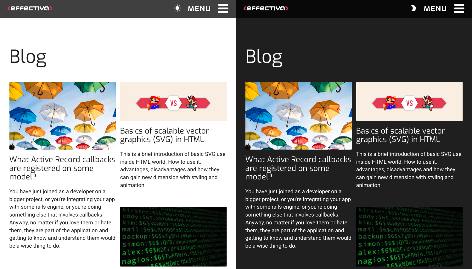
Implementing light and dark mode with switcher (part 2)

Learn how to integrate automatic theme switching on your web page based on the OS preference.
This part aims to get the browser to recognize your operating system's theme preference and remember it the next time you visit the web page.
Technologies used in this article:
- HTML
- SCSS mixin
- CSS custom properties (variables)
-
color-schemeandprefers-color-scheme
Defining light and dark mode style for our web page
Let's start working on the dark mode. We will use color-scheme property and prefers-color-scheme media query to achieve auto-detection of our operating system's (OS) theme preferences via CSS only.
Our website has light mode as default so we need to define the dark mode style.
color-scheme and prefers-color-scheme are very convenient to use with CSS preprocessor and SCSS mixin. We've created a separate stylesheet mixin.scss and defined custom variables for light and dark modes. Then we imported the mixin in the stylesheet where the styles for the :root are defined.
mixin.scss:
@mixin light-mode {
  --background: #fff;
  --color: #222;

  color-scheme: light;
}

@mixin dark-mode {
  --background: #222;
  --color: #fff;

  color-scheme: dark;
}
base.scss:
:root {
  @include light-mode;
}

@media (prefers-color-scheme: dark ){
  :root {
    @include dark-mode;
  }
}
Introducing classes for toggle button
We have reached our goal of setting our page to detect users' OS preferences for dark or light mode. But we know that we will be adding the option to change the mode manually later. While toggling the color theme can be done in various ways, we chose to do it by toggling .dark/.light classes via JavaScript (the process is covered in detail in the third part). Adding the .light class can be confusing, but it is necessary if we want to override dark mode manually. The only step left in this part is defining styles under each class for later use in the toggle button.
base.scss:
:root {
  @include light-mode;
}

/* used for toggling modes */
.dark {
  @include dark-mode;
}

@media (prefers-color-scheme: dark ){
  :root {
    @include dark-mode;
  }

  /* used for toggling modes */
  .light {
    @include light-mode;
  }
}
This way we respect the DRY principle, which has a few benefits:
- the variables are only defined once
- it is scalable so you can use it with just a few or a few thousand variables
- if you have to change a variable, you can change it in one place and don't have to go through the whole project, which significantly lowers the risk of mistake or omission and saves time
- the code is more readable
The caveat to this approach is that while your variables are not repeated in the project's source code, they will be on the compiled CSS.
Now the browser can detect our OS mode preference and our web page will be rendered in the OS preferred mode.

To see how to upgrade this and add a switcher for manually toggling dark and light modes, read the third part of the series.
Resources
Light/dark mode info & inspo:
Accessibility:

