Implementing light and dark mode with switcher (part 1)

Dive deep into key concepts for theme switching: CSS color-scheme and prefers-color-scheme.
The goal of this series on theme switcher implementation is to see how CSS property color-scheme and media query prefers-color-scheme work, demonstrating their practical application through automatic and manual theme switching. As a practical example, we will implement the dark mode alongside the pre-existing light mode of this web page, and subsequently add a manual switcher.
In this part, we will cover the concepts of color-scheme and prefers-color-scheme, which will be essential for our implementation of an automatic theme switch. The second part will show how to implement an automatic theme switch to this website that reacts to your operating system's theme preference. In the third part, we will implement the switcher for toggling modes by user action (manually).
Technologies used in this article:
- CSS
color-schemeandprefers-color-scheme
Let's see how each of them works and then we will learn how to combine them.
How to follow along
Before we start, I highly suggest opening this Codepen and following the steps I will describe to see the differences in practice.
See the Codepen color-scheme and prefers-color-scheme by Effectiva (@effectiva) on CodePen.
Also, open your operating system's settings for dark and light mode and have it ready because you will need to toggle it to see the effects of the code. To simplify things, examples will be shown on Mac OS and Chrome.
User Agent Stylesheets
The provided Codepen already has a simple markup and no CSS. This is what you should see.
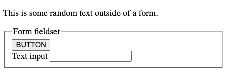
There is no style written, but there is some style applied.
How come?
This is because the user agent (UA) has its stylesheet. You can think of the word UA as another way to say the browser (most of the time). Each browser has its own stylesheet. Here they are for Chrome, Firefox, and Safari. Those stylesheets determine the default look and feel of the page. Different browser stylesheets agree on many aspects (such as blue links, black text, white background, etc.). However, there can be some differences, for instance, how they style form controls, so you won't see them the same if you browse in Chrome and Safari.
This is possible because CSS also has standardized semantic system colors. Those are the default color choices determined by the browser, the OS, or the user. That implies that our browsers can use their own or standardized semantic system colors.
How does all of this translate to our example?
We are viewing the markup in the browser and the browser is applying the UA stylesheet: the background is white, the text is black, and the button has some style. If you adjust your theme preferences in the Settings of your computer at this point, nothing will happen.
But if you add this to your Codepen CSS...
:root {
  color-scheme: light dark;
}
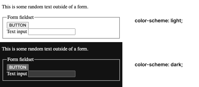
... you are instructing your browser to listen to your OS preferences and apply its stylesheet for light or dark mode. So now if you toggle your preferences from light to dark, this is the expected outcome.
Why does this happen when we add color-scheme?
By declaring color-scheme: light dark; you are saying that you support light and dark color modes. If you don’t explicitly set a background-color, color or any other style for your markup in each mode, the browser automatically sets one. The purpose of it is to more closely mimic the visual experience with other native apps in the OS.
color-scheme property signals the browser that your document can be rendered in both light and dark modes so when you change to dark or light in your OS settings, standard form controls, scroll bars, and a few other UI elements also change their look automatically.
This is a quick and simple way to get basic light and dark modes without writing additional CSS and defining the style.
color-scheme values
These are the currently supported values for color-scheme:
color-scheme: normal;
color-scheme: light;
color-scheme: dark;
color-scheme: light dark;
color-scheme: only light;
At the time of writing this article, there was no official mention of color-scheme: only dark; in the documentation, although there were a few articles regarding the limits associated with that combination. It will still function if used.
normal
Let's return to the Codepen and write this in the CSS box, then try changing your OS theme preferences to see what happens. With normal we are telling the UA that our document isn't aware of any color schemes. We can get the same result by omitting the color-scheme.
:root {
  color-scheme: normal;
}
Everything is rendered in the browser's default color scheme: white.
light, dark
light indicates that the element can be rendered using the OS light color scheme, and dark does the same for the OS dark color scheme.
:root {
    color-scheme: light;
}

:root {
  color-scheme: dark;
}
If you try it in Codepen and toggle your OS theme preference, you will see that the style becomes somewhat fixed if you write color-scheme: light;, it will always render it in light mode, independent of you changing the theme. Conversely, if you declare color-scheme: dark;, it will always render your page in dark mode.
Combining these two values indicates to the browser that your page can be rendered in both modes. The one you state first is the one you as the author prefer, but if the user prefers the second one, the page can be rendered in it, too.
:root {
  color-scheme: dark light;
}
only
There is one more value that can be used in combination with light or dark: only.
:root {
    color-scheme: only dark;
}

/* color-scheme can also be used on individual per-element level */

fieldset {
    color-scheme: only light;
}

input {
    color-scheme: only dark;
}
When we do that, we’re instructing the browser to opt an element into only the light color scheme, or only the dark one. So, if we set color-scheme: only light on an element, that element can receive the OS light color scheme, but cannot use its dark color scheme and vice versa.
To see it at work, add this to the Codepen, try changing the OS preference, and add/remove color-scheme: only light; on the form.
Try it also with color-scheme: only dark;.
:root {
  color-scheme: light dark;
}

form {
  // try commenting this out
  color-scheme: only light;
}
Note that it makes no difference if you switch words and accidentally write light only or dark only, it will function the same.
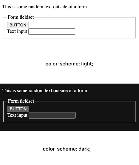
This is what you should see:
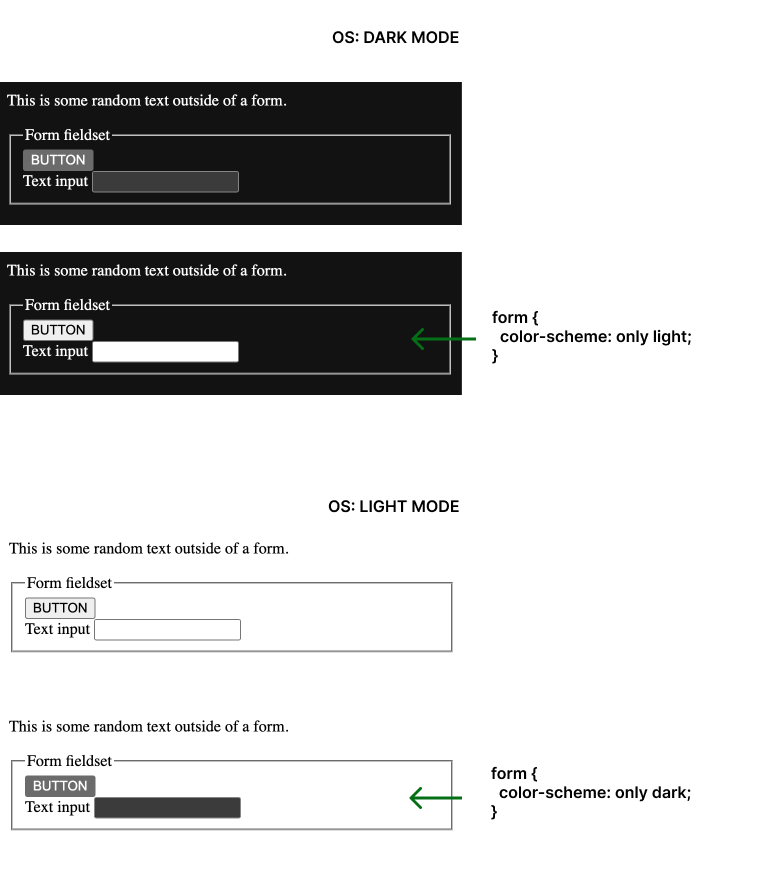
Notice that not everything is affected by this rule, only some of the controls inside of the form code.
color-scheme meta tag
If the CSS is referenced via <link rel="stylesheet">, using the color-scheme CSS property requires the CSS to be first downloaded and to be parsed. To help the browser in rendering the page background with the desired color scheme immediately, a color-scheme value can also be provided in a <meta name="color-scheme"> element.
By setting the value of color-scheme in the name attribute, it will apply to the whole page, as if it was set on the :root.
If you choose to do this and won't be specifying any custom properties for light mode, it's unnecessary to reiterate the color-scheme rule in CSS. However, if you intend to specify custom theme styles, the only purpose of adding this to <head> of the document would be to help the browser render the desired scheme quickly.
<meta name="color-scheme" content="dark light">
Combining color-scheme with prefers-color-scheme
If you want to add custom styles for both your light and dark modes, you will need prefers-color-scheme. Let's see why.
color-scheme will ensure that the browser will automatically render the web page following the OS-preferred theme, while prefers-color-scheme allows you to add your custom style for an entire element or just one property that will be different for each color mode. If we define some style, use color-scheme and don't use prefers-color-scheme, the style will be rendered the same in both light and dark mode. This will happen because there is nothing to tell the browser that that particular style should change when light/dark mode is changed and it is not specified what it should change to. So, it stays the same.
Try to add this to your codepen and toggle OS dark and light mode.
:root {
  color-scheme: light dark;
  color: red;
}
You will see that the font color stays the same in both modes.
We need prefers-color-scheme to tell the browser that this property should change when we are in dark mode and what color value it should change to. Setting the color-scheme will ensure that we get the browser default style for anything lacking a specified style, and by utilizing prefers-color-scheme we set our custom style for the font.
In this example, light mode is the default, and the media query is set to listen to the OS change to dark mode. Modes can also be set the other way around.
Play in the Codepen by adding/removing font colors for both modes and see different combinations when you toggle the OS-preferred mode.
:root {
  color-scheme: light;
  color: red;
}

@media(prefers-color-scheme: dark) {
  :root {
    color-scheme: dark;
    color: yellow;
  }
}
Alternatively, you can define color-scheme: light dark; on the first :root and omit it in the media query.
This will work for two reasons:
- With declaring
color-scheme: light dark;on the:rootwe told the browser that our page could be rendered in both modes. It will listen for the OS preference and apply changes. - Then, by using the
prefers-color-schememedia query on the:rootwe instructed the browser to implement the specified changes when it encounters a preference for dark mode.
The result will be the same as in the previous example and across browsers.
:root {
  color-scheme: light dark;
  color: red;
}

@media(prefers-color-scheme: dark) {
  :root {
    color: yellow;
  }
}
If we did not use prefers-color-scheme media query, only the second rule for :root would apply because of how stylesheets are read.
/*❗ This will apply the last rule ❗*/

:root {
  color-scheme: light;
  border: 5px dotted red;
}

:root {
  color-scheme: dark;
  border: 5px dotted white;
}
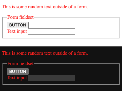
color-scheme and prefers-color-scheme can be combined to style the whole document, a specific element, or a specific property.
/* defines style for the whole document in light mode: only font will be red, everything else is set by the browser */
:root {
  color-scheme: light;
  color: red;
}

/* defines style for the paragraph in light mode */
p {
  color-scheme: light;
  color: green;
}

/* listens for change to dark mode on the OS, changes the font to yellow and paragraph to pink, everything else is set by the browser */
@media(prefers-color-scheme: dark) {
  :root {
    color-scheme: dark;
    color: yellow;
  }

  p {
    color: pink;
  }
}
This is what you should see.
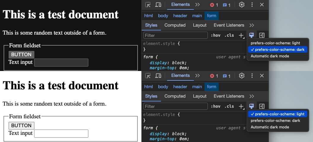
Dev tools
To help you check color mode changes while working, browsers have a part in their dev tools to test prefers-color-scheme. Here's how it looks in Chrome.
Finally, you can see the effect on a large number of HTML elements on a demo on Glitch.
Now let's see how to implement this knowledge in a practical example covered in the second part.
Resources
CSS color-scheme and prefered-color-scheme:
- MDN: color-scheme
- MDN: prefers-color-scheme
- W3C Color adjustment modules: Preferred color scheme
- W3C Color adjustment modules: Effects of the used color scheme
- Improved dark mode default styling with the color-scheme CSS property and the corresponding meta tag
- CSS system colors
- color-scheme demo on Glitch
- Don't forget the color-scheme property
Check the browser support:
- Can I Use: color-scheme